Data reporting: 6 best practices to elevate your decision‑making


Table of Contents

TL; DR
- Most companies suffer from bad data foundations that make every report suspect
- Inconsistent definitions, siloed systems, and manual processes quietly destroy trust and slow decision-making across the org
- Effective reporting starts upstream: clean data, governed metrics, automated pipelines, and a single, authoritative source of truth
- Clear structure, strong visual storytelling, and audience-specific insights turn reports from noise into real strategic leverage
- Avoid the six classic reporting traps (inconsistency, overload, poor quality, no narrative, wrong audience, manual workflows) to unlock faster, more confident decisions
If you’ve ever watched Succession, you know the most dangerous moment in the boardroom isn’t the yelling; it’s when no one trusts the numbers. That’s the real state inside most companies today: data scattered across tools, metrics defined 10 different ways, and dashboards that spark debate instead of decisions.
CTOs feel this pain more than anyone. You’re expected to enable “data-driven decisions,” but your team spends half its time stitching together pipelines, fixing bad schemas, and reconciling conflicting reports. Meanwhile, the business is moving faster than your data can.
This post gives you a practical blueprint for building clean, consistent, executive-ready reporting. And unlike the Fortune 50 with armies of engineers, you don’t need a dozen data plumbers to get there. With 5X, the plumbing is handled: automated pipelines, governed metrics, a self-service semantic layer, and dashboards built on a single, trusted source of truth.
What is data reporting?
Data reporting is the process of collecting, organizing, and presenting data in a structured format so that it informs decision-making. In simple terms, it’s about turning raw data into digestible information in the form of dashboards, charts, tables, slide decks, or written reports that communicate key findings and trends.
Unlike ad-hoc data analysis (which explores data to find new insights), data reporting focuses on conveying known metrics and performance indicators to stakeholders on a regular cadence.
At its core, data reporting answers the questions: “What is happening?” and “Where do we stand?”
For example, a weekly sales report might show current revenue vs. targets, broken down by region or product line. A customer support dashboard might display the number of open tickets and average response times.
💡Important:
Data reporting is only as good as the data behind it. If your underlying data is inaccurate or siloed in different systems, your reports won’t be trusted. That’s why modern data teams put heavy emphasis on data quality and integration before generating reports.
Data quality is critical to success because it impacts every business process and directly affects revenue. Every problem is a data problem. Bad and unusable data creates an opportunity cost of up to 35%; and a staggering 40% of organizational data is unusable!
~ Kevin Campbell, CEO, Syniti
HFS Research, in partnership with Syniti - June 2024
Why is data reporting important?
Good data reporting is often the difference between business success and failure. Here’s why it matters:
1. Business get minimum 15% increase in EBITDA
According to McKinsey, data-driven companies achieve a 15% to 25% increase in EBITDA. Clear reporting helps leaders replace intuition with insight—enabling faster, more confident decisions across strategy and operations.
2. Execs get a transparent view into how numbers are calculated
A well-crafted report builds a shared understanding of the truth. Executives can finally stop debating whose spreadsheet is correct.
72% of executives see data as crucial for decision-making, yet most struggle with trust. Data reporting instills confidence by providing consistent metrics and a transparent view into how numbers are calculated.
3. Every department comes on the same page
Reporting forces different departments to align on definitions and share information. Instead of marketing, sales, and finance each living in its own data silo, an organization-wide dashboard can unite them around common KPIs. This not only saves time but also unlocks insights between functions.
5X was instrumental in helping us gain a holistic view of our business. It was as if we had our own internal data team, working closely with stakeholders to ensure that data was actioned effectively.
~ George Ferreira, CTO, Upright
Upright Customer Story
4. People can take corrective action on time
Effective data reporting shines a light on problems while there’s still time to fix them. For example, a daily operations report might reveal a sudden spike in website errors or a dip in yesterday’s sales, enabling teams to respond immediately.
In contrast, without good reporting, issues might go unnoticed until the end of the quarter when it’s too late. Fast, reliable reporting = faster course-correction.
Also read: Top 10 Data Integration Tools in 2025 [Break Data Silos]
5. Teams stay focused on outcomes
What gets measured gets managed. When you put clear metrics in front of owners, it creates accountability for improvement.
This helps teams stay focused on goals and outcomes instead of anecdotes. For instance, if your business intelligence reports highlight that customer churn ticked up this month, the customer success team knows exactly where to focus their efforts.
Also read: How to Leverage Customer Retention Analytics for Business Success
Types of data reporting
Different audiences need different kinds of reports. Let’s break down a few common types of data reporting and what makes each unique:
1. Operational reporting (real-time, tactical insights)
Operational reports monitor the day-to-day running of the business. They are usually detailed, frequently updated (often in real-time or daily), and used by front-line staff or operations managers. The goal is to track current activity and fire off alerts when something deviates from the norm.
For example: a daily e-commerce dashboard showing today’s orders, inventory levels, and any system outages. Or a customer support queue report updated hourly.
Operational reporting helps answer questions like:
- “What’s happening right now?”
- “Do we need to take action immediately?”
Characteristics of operational reports:
- Granular and real-time: They show atomic data points (e.g. every transaction, every support ticket) or metrics updated continuously
- Often automated: Pulling from live systems or streaming data. Think IoT dashboards, live website analytics, etc.
- Used by operators and analysts: To keep the business running smoothly, fix issues, and optimize processes in-flight
2. Analytical reporting (investigative, diagnostic insights)
Analytical reports dive deeper to understand why things are happening. These are the reports data analysts or business analysts create to examine trends, patterns, and outliers.
Often ad-hoc or periodic (e.g. a weekly funnel analysis or a quarterly sales deep-dive), analytical reporting combines data from multiple sources and uses more advanced calculations.
The purpose is to support strategy and improvement by answering:
- “Why did we see this outcome?”
- “What can we learn?”
Examples:
- A marketing analysis report that correlates campaign spend with customer acquisition cost and lifetime value.
- A product usage report exploring which features drive retention, broken down by customer segment.
- A financial analysis looking at cost drivers behind a spike in expenses this quarter
Characteristics:
- Comparative and explanatory: Include variance analysis (vs. last period or forecast), correlations, and narrative explaining insights
- Visual and narrative: Might be in slide decks or notebooks with charts and commentary, not just raw dashboards
- Used by analysts, middle and senior management: to inform strategic decisions, planning, and optimizations
3. Executive reporting (high-level, decision-making insights)
Executive reports are high-level summaries for leadership and stakeholders (C-suite, board, investors). These focus on the vital few metrics that indicate overall health and progress toward goals. Executive reporting is typically done monthly or quarterly (think board report, monthly business review, etc.), and it prioritizes clarity and brevity.
The question it answers is:
- “Where do we stand against our objectives?”
- “What big trends do we need to know?”
Examples:
- A CEO’s dashboard with the company’s top 5 KPIs (e.g. revenue, growth rate, burn rate, NPS, etc.) with red-yellow-green status indicators
- A board report highlighting key financials, market updates, major initiatives status, and risks
- A departmental summary sent to executives to show progress on strategic projects (using data to back it up)
Characteristics:
- Concise and aggregated: Rolls up data to the strategic level (e.g. company-wide totals, quarterly averages) often with targets and benchmarks
- Visual and storytelling: May include trend charts, heatmaps, and very brief commentary. It should tell a story at a glance
- Forward-looking: Often includes forecasts or leading indicators to support proactive decision-making by leaders

Also read: How to build and improve data trust: Eight working strategies that move the needle
How to write a data report
Creating a data report is a careful exercise in communication. Whether you’re writing a one-page summary or building a live dashboard, follow these steps to ensure your report is clear, impactful, and actionable:
1. Know your audience and objective
Always start by asking “Who is this report for, and what do they need to learn or decide?”
A report for a CTO will look very different from one for a sales manager. Define the core question the report answers.
For example, “This report helps the VP of Sales see which regions exceeded quota and which fell short this quarter.” Having a sharp purpose prevents data overload and keeps the report focused on insights that matter to that audience.
2. Gather and prepare the right data
Identify the data sources you need and ensure the data is accurate. This might involve querying databases, using BI tools, or pulling from spreadsheets.
Most of the work behind a good report happens before writing. Make sure to clean the data (remove duplicates, correct errors) and consolidate it so you’re working from one dataset.
3. Structure the report logically
A well-structured report guides the reader through the information. Start with a high-level overview or key insight, then provide supporting details.
Use a logical flow, for instance, chronological (month 1 to month 3) or funnel stages (lead → opportunity → deal).
Break content into sections with clear headings. In a written report, you might have sections like Summary, Key Metrics, Analysis, Recommendations. In a dashboard, you might arrange visuals in tiers (top KPIs at top, drill-down charts below).
4. Use visuals and narrative to tell a story
Data visualization is your friend; a chart often conveys trends better than a table of numbers. Choose the right visuals (bar charts for comparisons, line charts for trends over time, pie or donut for composition, etc.), and keep them simple and clean.
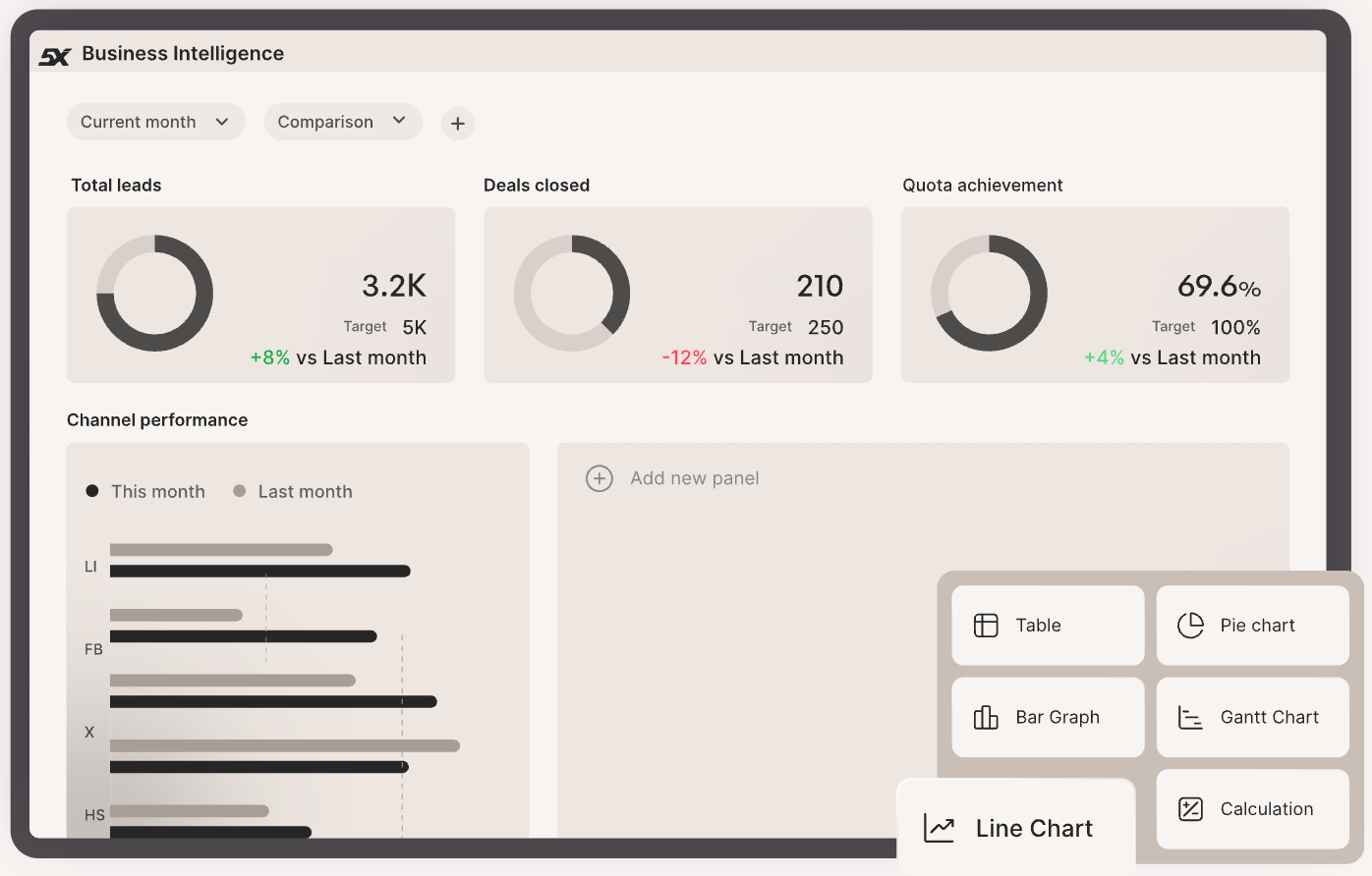
Every visual should have an easy-to-read label and, ideally, a takeaway caption.
For example, instead of a naked graph, add a note: “Q4 sales were 15% above target, driven by Europe (25% growth).”
Use callout boxes or color highlights to draw attention to notable points. Avoid jargon; use clear language and define any metrics that aren’t obvious.
5. Keep it concise and actionable
Especially for executive-facing reports, brevity is key. Stick to the most relevant metrics and insights. If something isn’t actionable or informative for the report’s goal, consider cutting it. Provide context for the numbers (benchmarks, targets, historical comparisons) so the reader knows if a metric is good or bad. Wherever appropriate, end with recommendations or next steps.
For example: “Given the decline in conversion rate, marketing should A/B test the new landing page design”. The goal is that after reading the report, the audience knows what decision or action is needed.
6. Review and iterate
Before releasing the report, double-check the accuracy of every figure and ensure consistency (e.g., do totals equal the sum of parts? Do names match definitions in other reports?).
If possible, have a colleague peer review it; they might catch things you missed or point out where interpretation could be unclear.
Ensure the report is formatted for readability: clear headings, not too text-dense, and with a logical flow. If it’s a recurring report template, gather feedback from end-users and iterate on it continuously.
7. Use 5X to simplify your reporting process
Many teams use 5X for interactive reporting or even conversational AI tools (like chatbots that can answer data questions on the fly). These can supplement static reports. The key is to reduce manual effort in updating reports.
Automating data refreshes and report generation using 5X ensures reports are always up-to-date without manual intervention, saving you time and ensuring stakeholders always see current information.
Also read: 6 Steps on How to Get Setup with your First Data Reporting Project
Avoid these 6 data reporting mistakes
Even well-intentioned data teams fall into some common traps when reporting. To ensure your reports actually drive action (and don’t mislead or frustrate people), be wary of these classic data reporting mistakes:
Mistake 1: Inconsistent metrics and definitions
Nothing erodes trust in reports faster than seeing two different numbers for what should be the same metric.
If Marketing’s report says 10,000 new users but Finance’s report says 8,000, people lose faith in the data. This usually happens when departments use different source systems or definitions (e.g. “new user” counted by sign-ups vs. first purchase).
Inconsistency in data across sources, often caused by siloed systems, is the #1 data quality challenge for organizations.
The fix: establish one source of truth and standard definitions. This is where a semantic layer or company-wide data dictionary helps. But more than that, you will see it’s a people issue. See what this Reddit user says from their experience.
On 5X, automated data modeling and governance enforce consistent definitions, so everyone is reporting apples-to-apples.
Also read: Data Quality Framework: Definition, Benefits, and Implementation
Mistake 2: Too much data, not enough insight
Ever seen a dashboard crammed with 40 charts, or a report that’s 50 pages long? Overloading your audience with data is a sure way to have them tune out. Remember, the report should answer a specific question or set of questions, not be a brain dump of everything you have.
Resist the urge to include every metric “just in case.” Focus on the critical few that matter, and provide context. It’s far better to highlight 5 actionable insights than to present 100 random stats with no narrative.
Avoid vanity metrics that don’t drive decisions. If you suspect a chart isn’t adding value, it probably isn’t.
Clarity beats quantity in data reporting.
Mistake 3: Neglecting data quality checks
A report is only as reliable as the data feeding it. Yet a surprising number of reports go out with obvious errors: negative values that shouldn’t be negative, percentages that total 300%, duplicate entries, etc.
These glitches can completely undermine your credibility. In fact, poor data quality costs organizations an average of $12.9 million per year through mistakes, rework, and lost trust. Always sanity-check your reports for anomalies and accuracy.
Put automated data validation in place where possible (e.g., alerts if data flows fail or values fall outside expected ranges).
Mistake 4: Lack of storytelling (just reporting numbers)
Dumping a lot of figures without explaining “so what” is a missed opportunity. Stakeholders shouldn’t have to play detective to understand the takeaway. It’s a mistake to assume the data speaks for itself.
Always add interpretation: highlight the trend, compare it to a goal, explain the why behind a change if you know it. Even a few bullet points of commentary can transform a report from confusing to compelling.
A great report tells a story: there’s a beginning (what question we looked at), middle (what we found), and end (what we recommend or conclude).
Mistake 5: Not tailoring to the audience
A technical data scientist and a non-technical CEO have very different needs. If you give the CEO a dense 30-page analysis full of SQL jargon, you’ve lost them. Conversely, an analyst might find an executive summary too superficial. Tailor depth and language to your readers. For leadership, focus on high-level insights and business impact (with maybe an appendix for detail if they want it). For a technical team, you can dive into methodology and granular data.
Also, use the right medium; busy execs might prefer a one-page email or interactive dashboard they can slice, whereas others might prefer a PDF report. One size does not fit all in reporting. The mistake is failing to consider what the audience cares about and how they consume information.
Mistake 6: Manual, outdated reporting processes
This is more of a process pitfall, but it’s important. If your reporting relies on manually exporting CSVs, copying into Excel, updating pivot tables, and emailing them around… it’s ripe for error and delay. Manual processes also mean reports get outdated quickly.
Automate as much as possible: scheduled data pipelines, auto-refreshing dashboards, and self-service tools for stakeholders. Not only does this save analyst hours, it ensures decision-makers always have the latest data.
Make data reporting suuuper easy with 5X
You don’t need FAANG budgets to get A-grade reporting: modern cloud stacks and managed platforms make enterprise capabilities accessible.
5X operationalizes the playbook—automated ingestion and pipelines, continuous quality checks, governed metric definitions and a self-service semantic layer—so teams focus on insights, not plumbing.
Start small: run a one-week readiness check, pilot a high-impact exec dashboard, then convert it into templates and governance. With 5X’s prebuilt connectors, models, automated checks, and Jumpstart options, you can move from proof-point to production in weeks, not quarters.
FAQs
How do you make data reports more engaging?
What’s the best way to structure a data report?
How often should data reports be updated?
How do you choose which metrics to include in a report?
Building a data platform doesn’t have to be hectic. Spending over four months and 20% dev time just to set up your data platform is ridiculous. Make 5X your data partner with faster setups, lower upfront costs, and 0% dev time. Let your data engineering team focus on actioning insights, not building infrastructure ;)
Book a free consultationHere are some next steps you can take:
- Want to see it in action? Request a free demo.
- Want more guidance on using Preset via 5X? Explore our Help Docs.
- Ready to consolidate your data pipeline? Chat with us now.
Related articles

.png)

How retail leaders unlock hidden profits and 10% margins
Retailers are sitting on untapped profit opportunities—through pricing, inventory, and procurement. Find out how to uncover these hidden gains in our free webinar.
Save your spot